Temperature Data
2008-10-13 15:26 - Tech
In my previous post, I discussed how I finally had a working, external, thermometer hooked up to my linux server at home. It's been running for a few days now, and I took the opportunity to set up rrdtool for the first time, to log and graph the data it produces.
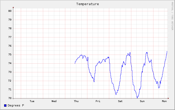
The result is the graph you see above. The results are a bit interesting. Each day has the large peak and trough like you might expect. But the peak of each peak is really three little humps, sometimes even, sometimes uneven, but there's always three. I wonder if it's just a coincidence, and if not, what might the explanation be?